
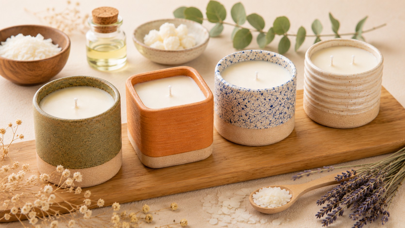
Some homemade candles instantly look polished and expensive. Others are more like a craft project, even when the materials are nearly identical.
The difference usually is not expensive supplies or advanced candle-making skills. Small design choices shape the entire presentation. Once those details start working together, even a simple candle can look far more refined.
Putting together a thoughtful gift? This guide makes a beautiful companion project.

The Vessel Feels Intentional
The container shapes the entire candle before the wick is ever lit. One of the biggest differences between boutique candles and basic candles is the vessel itself.
Simple shapes often appear more expensive than overly decorative containers. Matte finishes, ceramic textures, tinted glass, and heavier vessels create a cleaner, more refined appearance than lightweight jars with bright colors or shiny finishes. Softer tonal palettes also create more visual calm than strong contrast or several competing colors.
Candles look more cohesive when the vessel matches both the scent and the surrounding space. A minimal candle in a neutral vessel appears polished because every detail supports the same atmosphere.
Pro Tips:
- Stick to vessel shapes with clean lines
- Heavier-looking materials create a more luxurious appearance
- Soft tonal palettes create a calmer overall quality
- Choose vessels that match both the scent and the room

The Wick Style Changes the Entire Look of the Candle
Most people think about wicks as purely functional, but the wick also affects the visual balance of the candle.
A thin wick inside a wide vessel can make the candle seem unfinished. Wooden wicks and slightly wider wicks create more presence and help larger candles feel visually balanced. They also add texture without making the candle overly decorative.
Scale matters here. Well-designed candles keep the wick proportional to the size of the vessel instead of treating it like an afterthought.
Pro Tips:
- Wider vessels pair better with a more substantial wick
- Wooden wicks create a softer, more luxurious appearance
- Double wicks help larger candles look more balanced
- Wick scale should match the size of the container

The Scent Matches the Style of the Candle
Candles feel more refined when the scent supports the visual style of the candle itself.
A soft cream candle paired with linen, sandalwood, or light cedar creates a cleaner, more cohesive presentation. Darker vessels often pair better with smoky, earthy, or wood-based scents because the fragrance and styling support the same mood.
Problems usually start when too many ideas compete with each other. Sweet fragrances mixed with bright colors, oversized labels, or heavy decoration make the candle cluttered instead of polished.
The most expensive-looking candles usually stay focused on one clear atmosphere instead of combining several unrelated aesthetics.
Pro Tips:
- Let one mood guide the entire candle
- Softer scent profiles create a more refined atmosphere
- Earthy, woody, fresh, and clean scents pair well with minimal styling
- Avoid combining too many competing visual themes

The Surface is Clean and Finished
The top of the candle affects the entire presentation. Even beautiful vessels can seem less polished when the wax surface appears rough or uneven.
Refined candles usually keep the surface simple and clean because smooth finishes create stronger visual balance. Dramatic texture can make candles heavier or more cluttered, especially when the vessel and label already contain a lot of detail.
The goal is not perfection. Small imperfections matter far less than overall presentation.
Pro Tips:
- Smooth wax surfaces appear more refined
- Minimal texture creates a cleaner, more modern appearance
- Tiny imperfections matter less than overall visual balance
- Simple finishes create the most timeless result

The Label Supports the Candle Instead of Competing With It
One of the fastest ways to make a candle feel cluttered is an overly busy label.
The most boutique candles rely on restraint. Simple typography, softer colors, and more spacing create a cleaner appearance than crowded graphics or oversized branding. Labels also are more refined when they stay proportional to the vessel instead of dominating the front of the candle.
The most polished candles allow the vessel, wax, wick, and texture to remain the focus.
Pro Tips:
- Simple typography looks more expensive
- Neutral labels create a softer overall presentation
- Too many fonts or colors overwhelm the design
- Negative space creates a calmer, more balanced feel

The Candle is Beautiful Even Before It’s Lit
High-end candles often work as decor as much as fragrance products. They contribute to the atmosphere of a room even when they are not burning.
Styling plays a major role in that presentation. Candles look more expensive when they sit alongside softer textures and natural materials instead of standing alone without context. Linen, stone, wood, trays, and stacked books help candles blend naturally into a space.
Scale matters here too. Well-styled candles are visually balanced within a room instead of oversized, undersized, or overly decorated ones.
Pro Tips:
- Style candles alongside softer textures and natural materials
- Simple groupings create a more refined aesthetic than oversized displays
- Candles look more expensive when they blend naturally into the room
- Let the candle contribute to the atmosphere instead of dominating it
The Real Difference Is Usually Restraint
Boutique candles rarely rely on extra decoration.
The vessel, wick, scent, label, and styling work together instead of competing for attention. That balance changes the entire presentation of the candle.
In many cases, the simplest candles end up looking the most expensive.
*Many of the same design principles also apply to soap making, especially when small presentation details shape how handmade products feel overall.