
This post may contain affiliate links. As an Amazon Associate, this site earns from qualifying purchases at no extra cost to you.
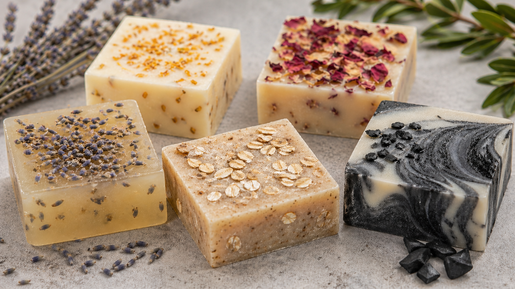
Some homemade soap looks like it could sit in a boutique shop window.
Other bars look… clearly homemade in a way that feels a little flat or unfinished.
What’s interesting is that both can be made with the same method, the same melt-and-pour base, and even similar ingredients. The difference usually isn’t effort — it’s visual structure. Once you start noticing what changes perception, it becomes much easier to shift your soap from “craft project” to something that looks intentionally designed.
Here are the most common reasons homemade soap looks basic, and how to fix them in a way that actually changes the final result.
If you’re just getting started, you don’t need a huge collection of supplies. A good-quality melt-and-pour soap base, a simple silicone mold, and a small set of mica colorants will let you create dozens of beautiful designs before you ever need specialty tools.

1. There’s no visual structure or focal point
One of the biggest reasons soap looks basic is that everything is evenly distributed.
When color, texture, and add-ins are spread uniformly, the eye has nowhere to land. Even beautiful ingredients end up feeling flat.
What to do instead:
Design with a focal point in mind.
One thing that makes creating a focal point much easier is using individual cavity silicone molds instead of large loaf molds. Since each bar is poured separately, it’s easier to position dried flowers or decorative details exactly where you want them.
🔧 Pro Tips:
- Choose ONE “hero area” (top center or one corner of the bar)
- Keep the rest of the soap visually simple so the focal point stands out
- Add your most visually interesting element only at the end (not mixed throughout)

2. The color feels flat instead of dimensional
Even pretty colors can look basic if everything is one tone or opacity. Flat color reads as “beginner soap” because it lacks depth.
What to do instead:
Build subtle contrast within your palette.
Consider investing in a small mica powder set rather than buying individual colors. Having several shades to work with makes it much easier to layer color and create the soft dimension that gives handmade soap a more professional look.
Pro Tips:
- Use two strengths of the same color (light + deeper version)
- Leave a small portion of the base uncolored for balance
- Add color in stages instead of mixing everything fully at once

3. Add-ins are scattered instead of designed
A common mistake is treating add-ins like ingredients instead of design elements. This creates randomness instead of intention.
What to do instead:
Place add-ins with purpose, not distribution.
My favorite add-ins are simple dried botanicals like lavender buds, calendula petals, rose petals, and cornflowers. They add texture and color without overwhelming the design, especially when they’re grouped into one intentional focal area.
Pro Tips:
- Group botanicals into small clusters instead of spreading them evenly
- Add them to the surface after a light set for control
- Stick to 1–2 add-in types per bar for a cleaner, boutique look

4. There’s no contrast in texture
When everything is smooth or everything is heavily textured, the soap loses visual interest. Boutique-looking bars rely on contrast.
What to do instead:
Balance smoothness with intentional texture.
Household utensils work perfectly well, but if you find yourself making soap regularly, inexpensive soap texturing kit can make it easier to create consistent finishes from batch to batch.
Pro Tips:
- Add texture only to the top layer, not the entire bar
- Use simple tools (fork, skewer, spoon) to create directional texture
- Leave part of the surface completely smooth for contrast

5. It was mixed instead of intentionally arranged
This is the biggest difference between basic soap and boutique-looking soap.
Most soap is made by mixing ingredients and pouring. But visually elevated soap is intentionally arranged before anything is melted.
What to do instead:
Start with a visual plan, not a recipe.
Before I even melt the soap base, I like to arrange all of my colors and botanicals on the counter. Small silicone measuring cups and pouring pitchers make it much easier to organize everything before you begin.
🔧 Pro Tips:
- Before pouring, decide: “Where should the eye land first?”
- Lay out your ingredients on the counter like a design palette
- Assign roles: base, accent, and focal detail before you begin

Where add-ins actually fit in
Once structure and design are intentional, add-ins become powerful styling tools — not fixes for flat soap.
But the key is this: add-ins enhance design, they don’t replace it.
If you’re ready to turn these design principles into results, this guide on 15 Soap Add-Ins That Instantly Make Melt-and-Pour Bars Look Boutique breaks down exactly which small details make soap look instantly more elevated.
Favorite Supplies for Boutique-Looking Melt-and-Pour Soap
If you’re building your soap-making supplies, these are the items I reach for most often:
- Quality melt-and-pour soap base or this other melt-and-pour base
- Silicone cavity molds
- Mica powder colorants
- Dried lavender buds
- Calendula petals
- Rose petals
- Cornflower petals
- Isopropyl alcohol spray bottle
- Silicone measuring cups and pouring pitchers
The real takeaway
Most homemade soap doesn’t look basic because of what’s missing.
It looks basic because nothing is being visually directed.
Once you start thinking in terms of:
- focal points
- contrast
- placement
- intentional layering
… even the simplest melt-and-pour recipe can start to look like something you’d expect to see in a boutique shop.
It’s not about making soap more complicated.
It’s about making it more intentional.
Putting together a thoughtful gift? This inspirational guide gives you 12 ways to wrap your soap so it looks boutique.